CashCloud
A B2B payments platform moving over $100M a month. I led design across web, iOS and Android, and built its bank verification, payment-method switching and nationwide check printing services.

Client:
Printech Global Secure Payment Solutions · Miami, FL
Category:
Fintech · B2B Payments
My Role:
Senior Product Designer · Design Lead
Senior Product Designer / Design Lead · Miami, FL, USA (remote) · Contractor · 10/2023 – 08/2026
A B2B payments platform that replaces manual check writing and centralizes supplier payments, handling check, eCheck and ACH under SOC 2 compliance. It is used by banks, insurers, healthcare systems and public agencies — Citi Bank, Butterfield Bank, Banco de San José and the NYC Employees’ Retirement System among them — and moves over $100M a month in payment transactions. I joined to design one mobile screen; fifteen months later I led design across the entire product: web, iOS and Android.
At a glance
Role: UI Designer in October 2023, UX/UI Designer in January 2024, Product Designer in June 2024, Senior Product Designer and Design Lead from January 2025 until the contract ended in August 2026.
Scope: three clients — web, iOS and Android — plus the design system behind them and the public product site.
Constraints: SOC 2 compliance, multi-factor authentication, layered roles and permissions, and money that cannot be pulled back once a payment leaves.
Research: close to 100 customer interviews, plus usability testing and prototype validation before build.
Numbers: over $100M a month in payment transactions, 45% of payment approvals now made from a phone, 5,639 payments switching method every month, 23 client companies designing their own checks.
Who it is for
Two sides of the same payment. On one side, the finance team that issues it: they need control, approvals, signatures and an audit trail. On the other, the payee — a supplier or a contractor — who only wants the money, in the form that suits them, without chasing anyone for the invoice detail. Nearly every decision on this platform had to hold for both.
How I worked
Payments is an unforgiving domain: a mistake is not a bad screen, it is money in the wrong account. That shaped the method more than any framework did.
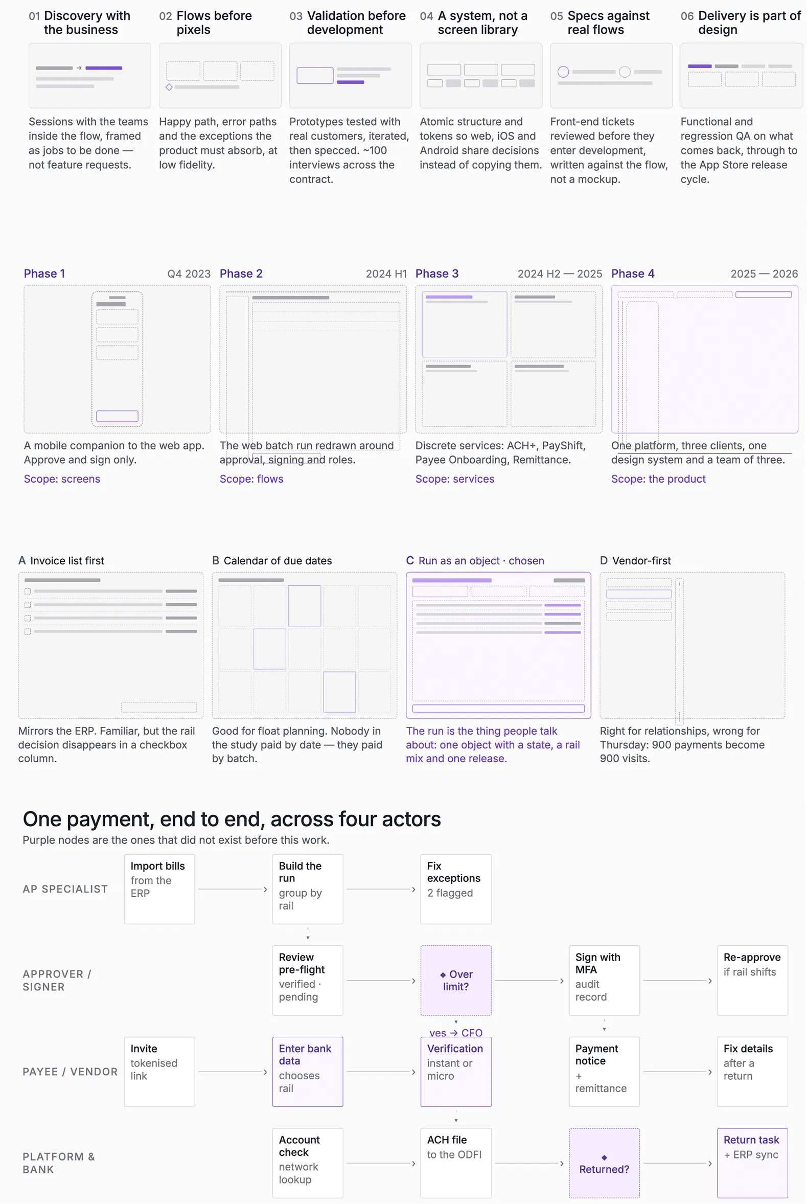
Discovery with the business first. Sessions with the teams that live inside the flow, framed as jobs to be done rather than feature requests, and closed with a written hypothesis and the metric that would tell us it worked.
Flows before pixels. Every service started as a low-fidelity flow covering the happy path, the error paths and the exceptions the product has to absorb. Cheaper to argue about a diagram than about a built screen.
Validation before development. Prototypes tested with real customers, iterated, and only then specced. Close to 100 interviews across the contract.
A system, not a screen library. Atomic design and design tokens so web, iOS and Android could share decisions instead of copying them, with WCAG contrast checked at the token level.
Delivery is part of design. Specs written against the real flows, front-end tickets reviewed before they entered development, and functional and regression QA on what came back, through to the App Store release cycle.
Case 1 — The service that stops a wrong payment before it leaves
The problem
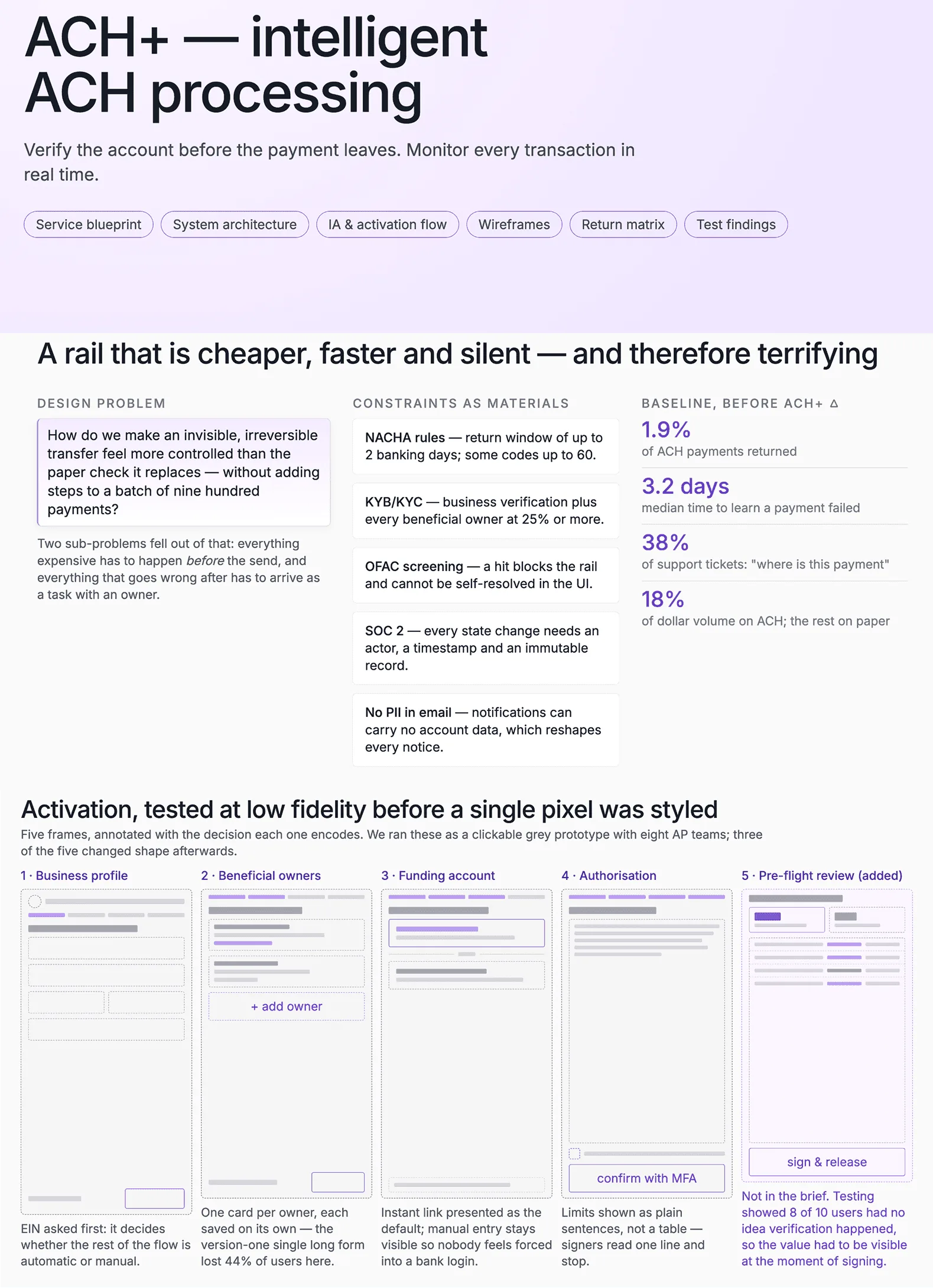
When a company pays by ACH, the most expensive mistake shows up after the payment is issued: the wrong account, a return, manual reconciliation. Every one of those is a person on the phone with a bank, a payee who has not been paid, and a finance team that stops trusting the tool. CashCloud needed to catch it before the payment left, not after.
Research and flows
Before the interface there was the flow. These are the low-fidelity flows and wireframes for ACH+: states, error paths and the exceptions the service has to absorb. They came out of customer interviews and usability testing, and they are what I used to align the business and backend teams before drawing a single screen.
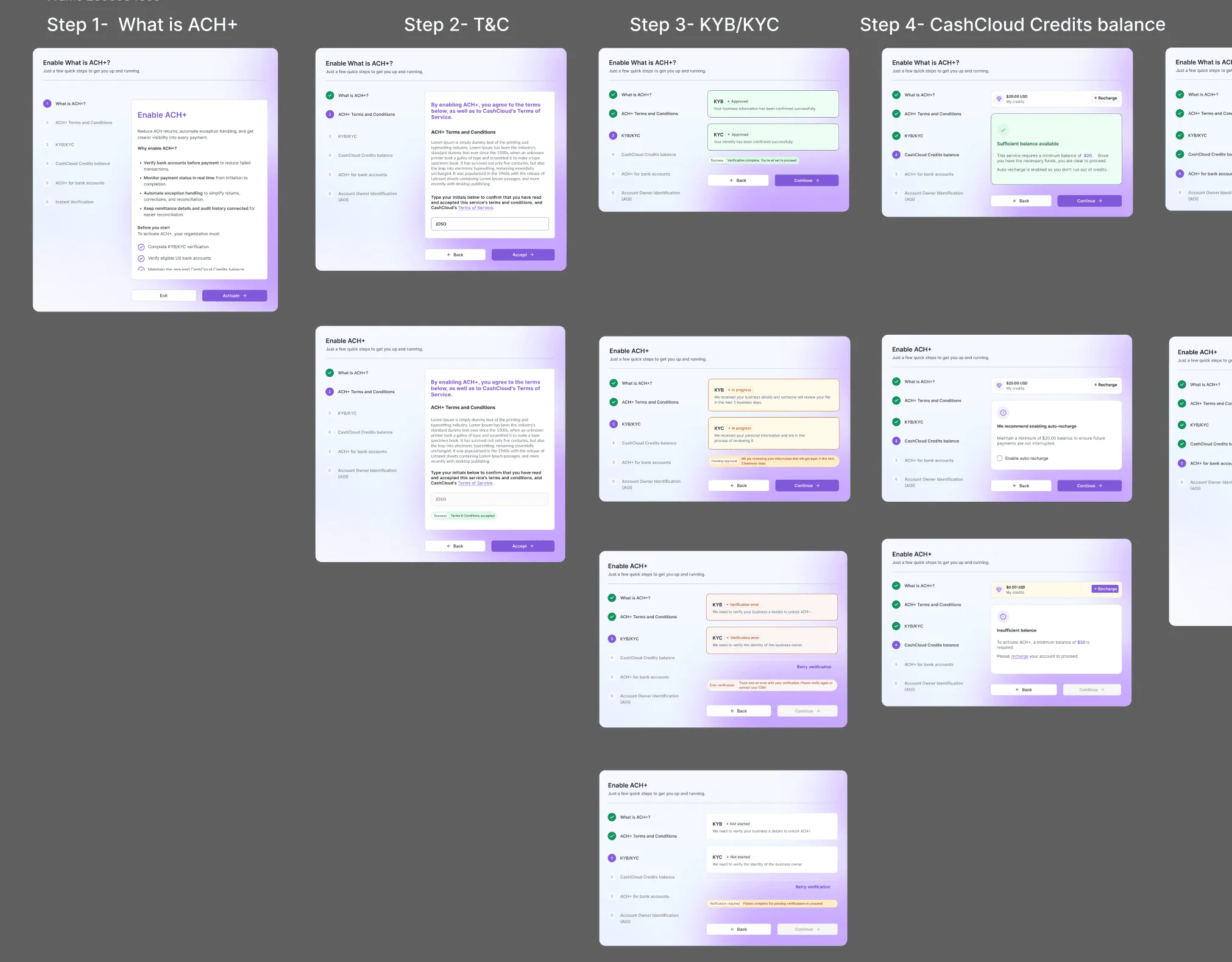
The full design process for the ACH+ activation wizard, flows included, is on this board: open it in FigJam.
What I designed
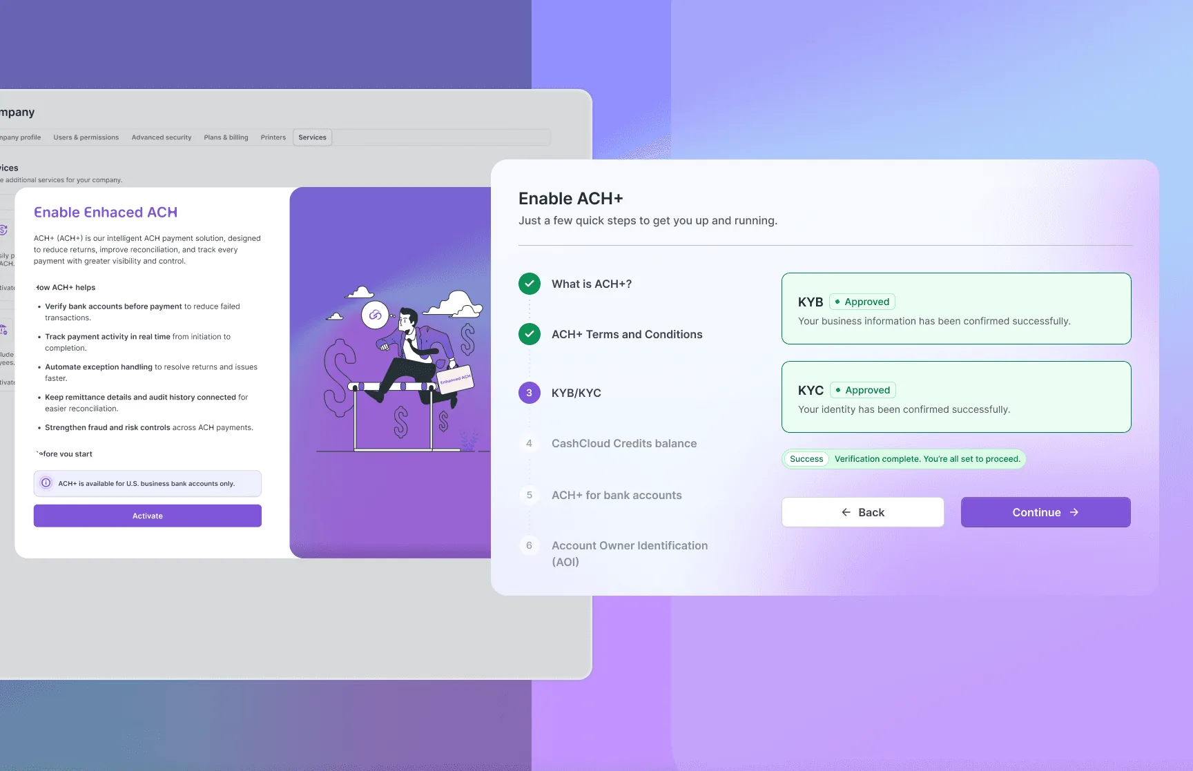
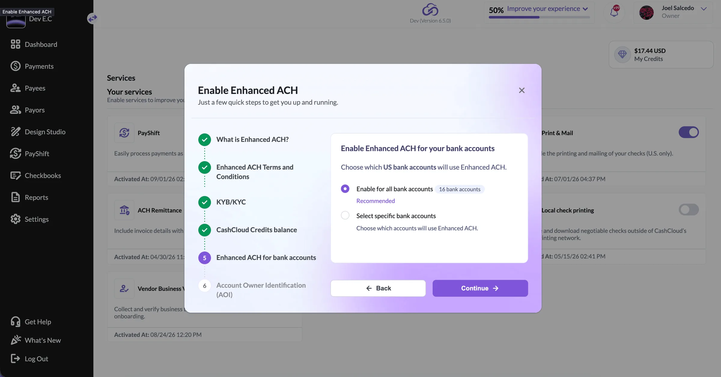
The whole service: bank account verification before the payment is issued, real-time monitoring of every transaction, and automated returns, corrections and reconciliation. It includes the activation flow with KYB/KYC verification, where a company proves who it is before it can move money.
Activation as a wizard, not a form. KYB and KYC are long and legally loaded. Splitting them into visible steps with their own state — pending, approved, rejected — let a finance team stop halfway and come back without losing the paperwork.
Verification before the money moves. The account is checked when it is added, not when the payment fails, which is what turns a return into a non-event.
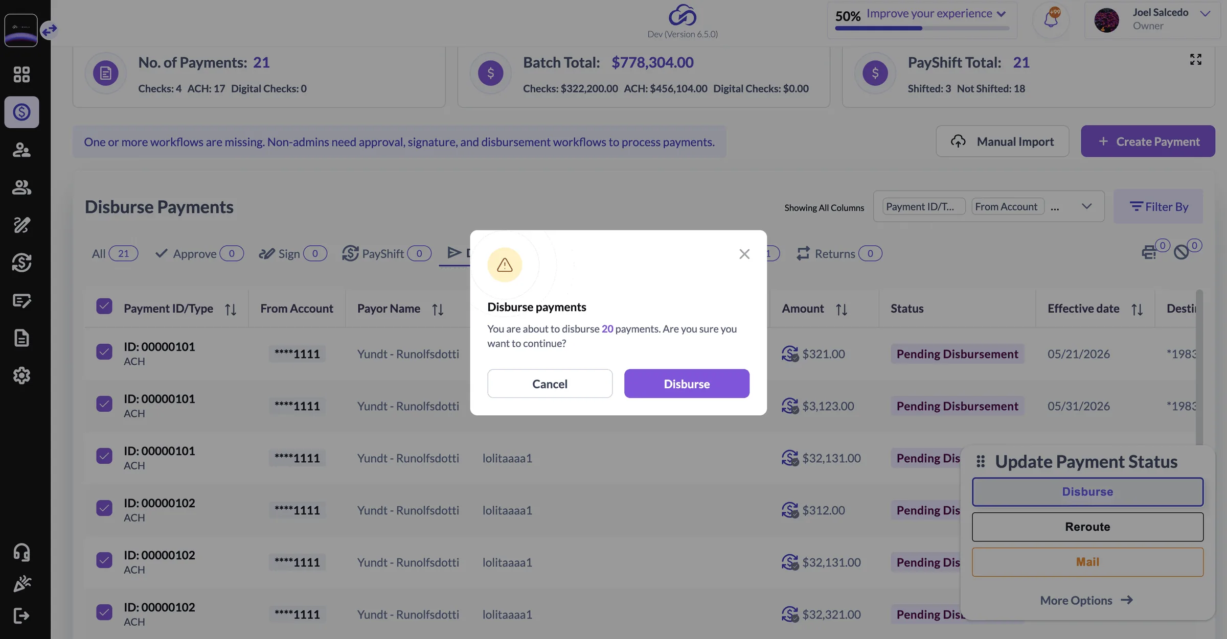
Exceptions as a first-class screen. Returns, corrections and reroutes have their own status and their own actions, so recovering from a failed payment is a task in the product rather than an email thread.
How I knew it worked
Prototypes went in front of customers before development started: finance people running their own activation, on their own vocabulary, with me watching where they hesitated. The wizard changed twice because of what those sessions showed.
Result
ACH+ runs in production inside a platform that moves over $100M a month in payment transactions, and it is sold as one of the reasons companies move off manual checks.
Case 2 — From one mobile screen to leading design across three platforms in 15 months
Web, iOS and Android did not share a visual language. Each client felt like a different product.
The problem
CashCloud needed a mobile version of its payments platform. What it actually had were three products wearing the same logo: web, iOS and Android did not share a visual language, a component or a definition of what “approved” looked like. Every new feature was designed three times, and a customer who moved between devices had to relearn the product.
Research and flows
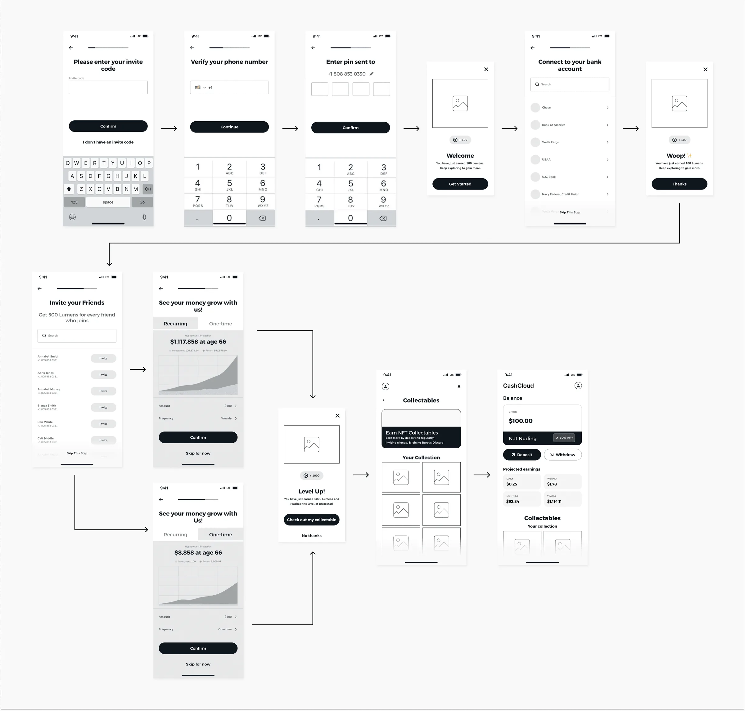
The flows and low-fidelity wireframes behind the platform: onboarding, payee management, approval, signature and disbursement, mapped across web, iOS and Android before any interface work started.
What I changed
One product across three clients. Web, iOS and Android built with my design team on a single visual language instead of three separate criteria, each still respecting its platform: Human Interface Guidelines on iOS, Material conventions on Android.
The full money path, defined end to end. Onboarding, payee management, approval, signature, disbursement and fraud controls, including who can do what at each step.
Security as part of the interface. SOC 2 compliance, multi-factor authentication and layered roles and permissions designed into the flows rather than bolted on as warnings.
A design system built for this product. I replaced the inherited generic kit. The real impact is not the component library; it is that the team stopped rebuilding the same pattern three times, once per platform.
The design system
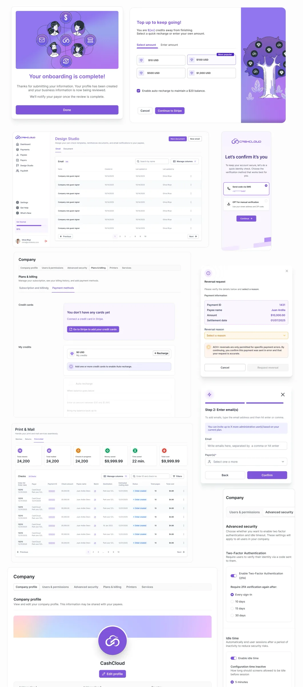
Rebuilt from scratch for the product: colour scales with the contrast ratio checked on every step and AA or AAA marked on each swatch, semantic roles for brand, error, warning and success, light and dark grey models, and the components and tokens the three clients share. In a payments product the palette is not decoration — green, amber and red are the difference between a payment that settled, one that is waiting and one that failed, and a finance team scanning a list of two hundred payments reads colour before it reads text.

Result
One product with one language across web, iOS and Android, used by hundreds of companies, and a team that ships a new service once instead of three times.
Three services in detail
Easy Mode
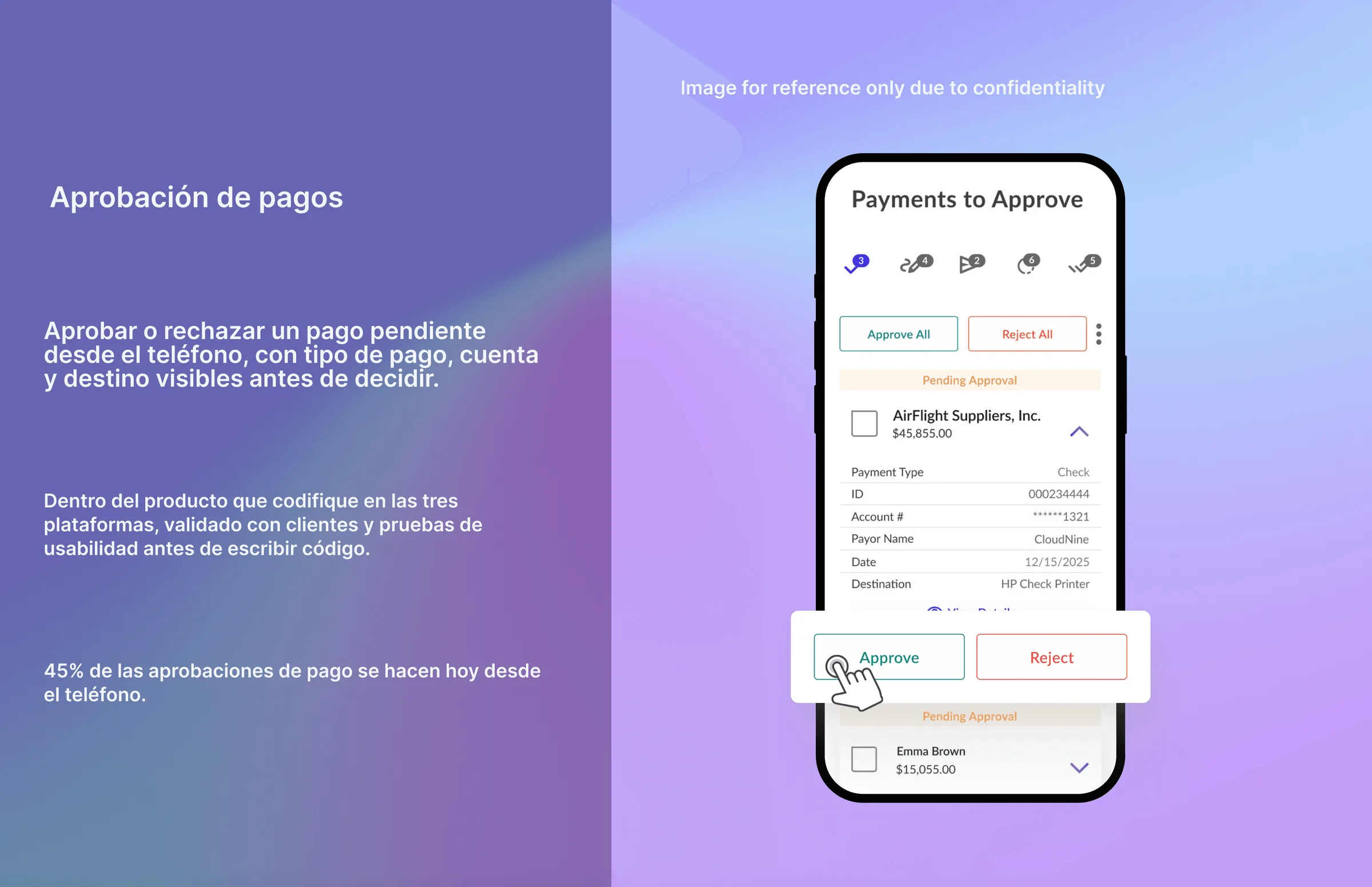
The process I designed to speed up payment approval on mobile, shipped as CashCloud On the Go. The approver opens the app and sees every payment waiting on them, expands one to check payment type, ID, account, payor, date and destination, and approves or rejects it right there — one at a time or all at once — without going back to the desktop platform. Approval was the step that held everything else up: a payment sitting in a queue is a supplier not being paid, and the person who has to approve it is usually the one least likely to be at a desk. Today 45% of payment approvals happen from the phone.
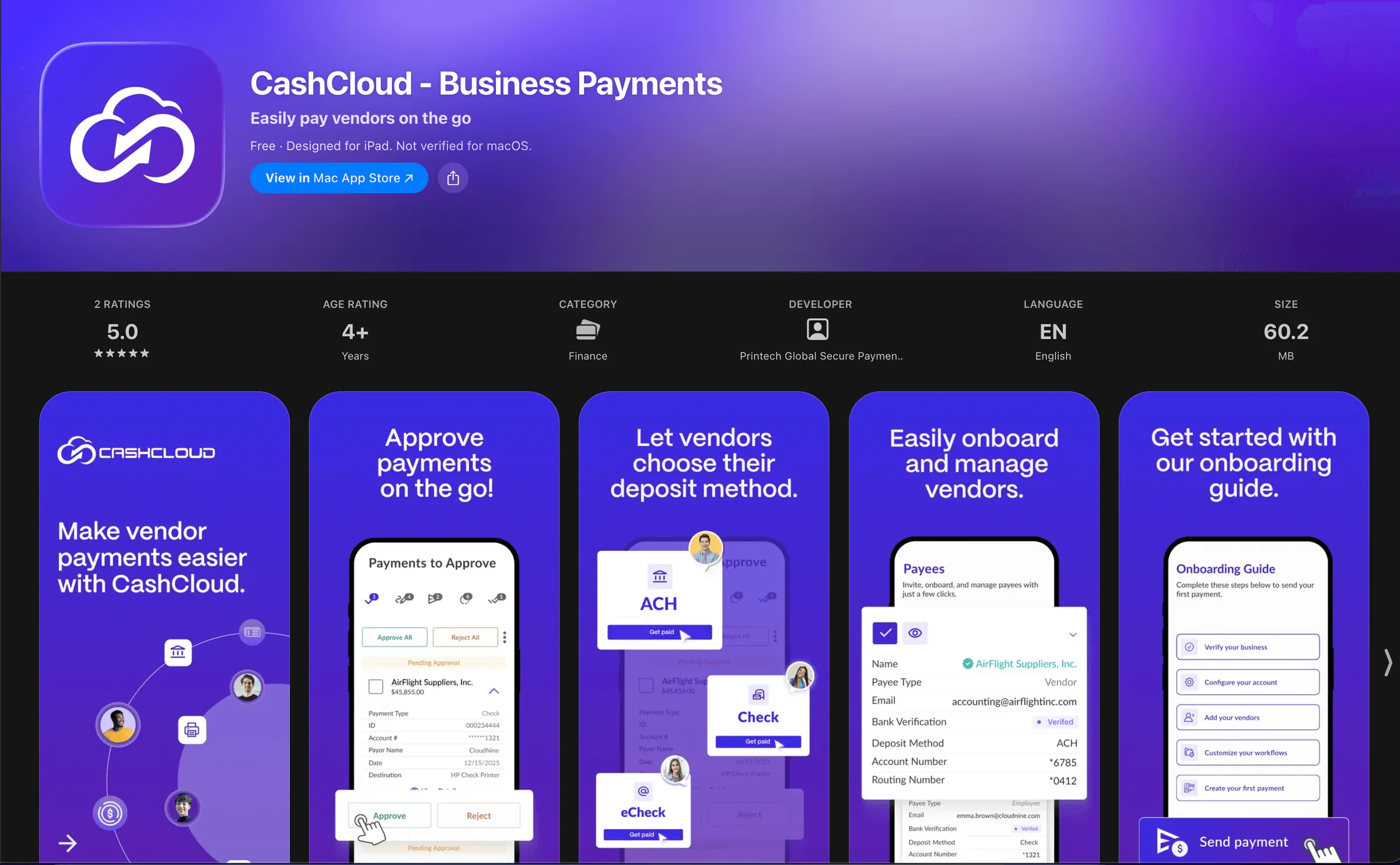
The iOS app is live on the App Store: CashCloud Business Payments.
Check Design Studio
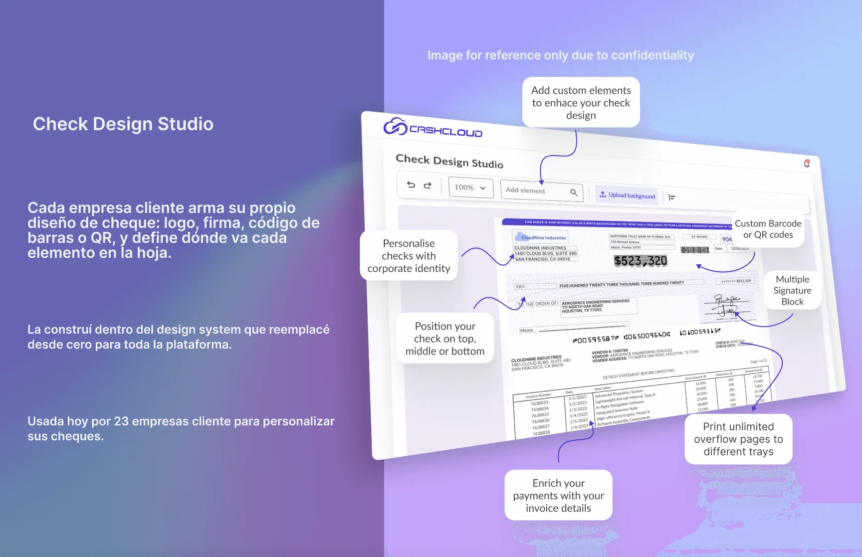
Every client company lays out its own check: logo, signature, barcode or QR, and where each element sits on the sheet. Checks are a legally constrained artefact — the position of a field is not a style choice — so the editor had to allow identity without ever letting a company break the parts a bank needs to read. I built it inside the design system I had rebuilt from scratch for the platform. 23 client companies use it today to customize their checks.
PayShift
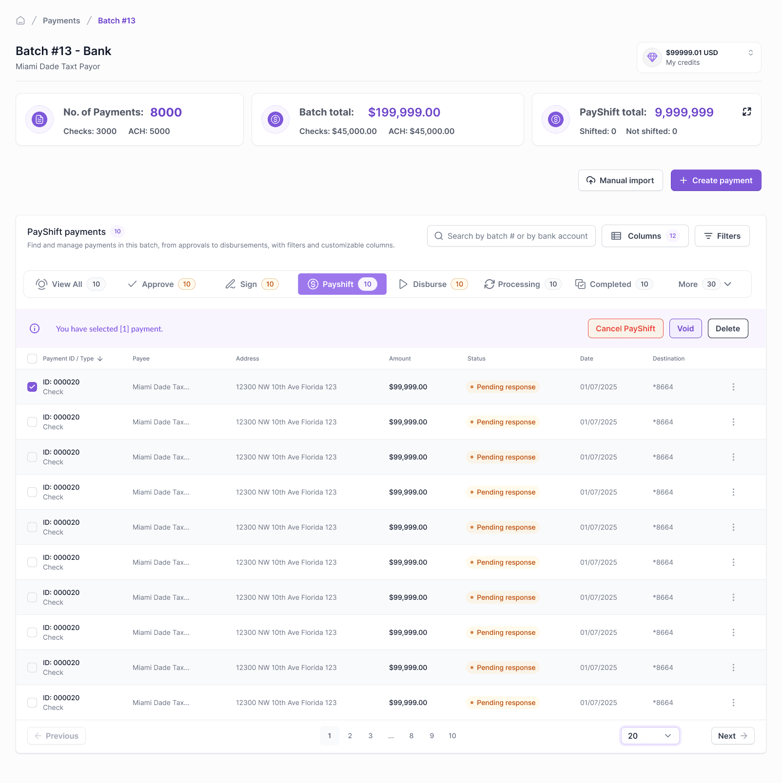
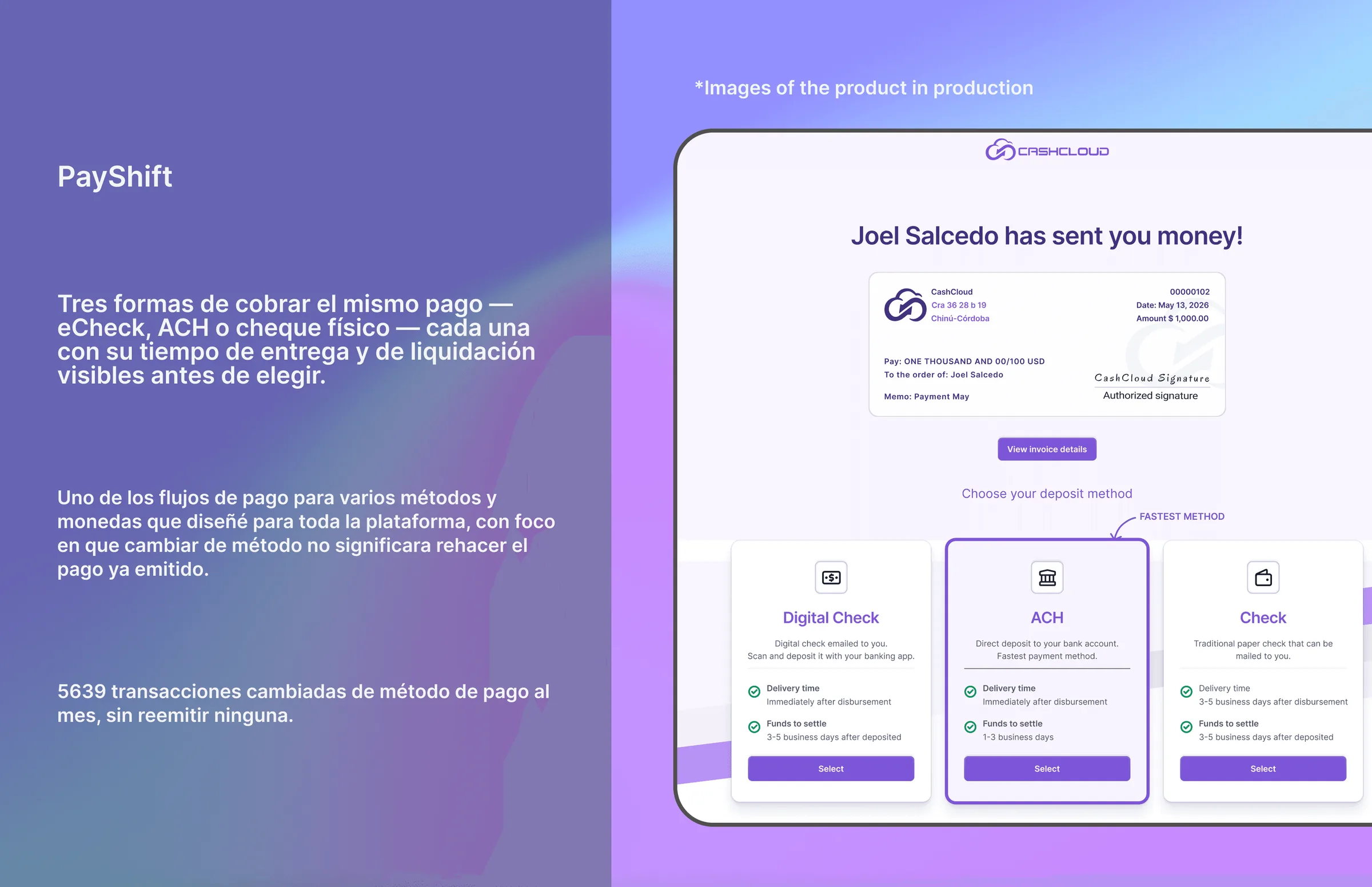
Three ways to collect the same payment — eCheck, ACH or a physical check — each showing its delivery and settlement time before the payee chooses. It is one of the multi-method, multi-currency payment flows I designed for the platform, built so that switching method would not mean reissuing a payment that was already out: the payer keeps a single record and the payee gets to pick. 5,639 transactions switch payment method every month, none of them reissued.
Other services I built
Positive Pay — check fraud prevention. The platform tells the client’s bank about every payment before the check is presented, so anything that does not match gets stopped.
Print Mail — prints and physically mails checks to the recipient anywhere in the United States.
Payee Onboarding — the flow where a payee enters their bank details and chooses how they want to get paid.
ACH Remittance — invoice detail attached to every ACH payment notification, so payees reconcile without asking for extra information.
Accounting integrations — connection with QuickBooks Online and Desktop, NetSuite, Xero, SAP, Dynamics 365, Sage Intacct, Oracle Financials and Thomson Reuters, so that connecting an accounting system stopped being a technical errand for the customer.
Working with engineering
Design did not end at handoff. I wrote the specs against the real flows — states, permissions and error paths included — reviewed front-end tickets before they entered development, and ran functional and regression QA on what came back, through to the App Store release cycle. When the spec and the build disagreed, the flow diagram settled it, which is the cheapest argument a team can have.
The public product site
I also designed and built CashCloud’s public product site in Webflow: information architecture, visual design, responsive build and publication, including the product pages for PayShift and Positive Pay. getcashcloud.com

Related Projects

